
Zach Slaton, author of A Beautiful Numbers Game blog and Arsenal fan, recently asked to take a look at the massive Transfer Price Indexdatabase, to apply some advanced statistical analysis to the findings. What follows is a fairly complex, but also compelling, look at the correlation between transfer spending and league position.

Soccernomics Was Wrong: Why Transfer Expenditures Matter, and How They Can Predict Table Position
“In fact, the amount that almost any club spends on transfer fees bears little relation to where it finishes in the league. We studied the spending of forty English clubs between 1978 and 1997, and found that their outlay on transfers explained only 16 percent of their total variation in league position. By contrast, their spending on salaries explained a massive 92 percent of that variation. In the 1998-2007 period, spending on salaries by clubs in the Premier League and the Championship… still explained 89 percent of the variation in league position. It seems that high wages help a club much more than do spectacular transfers.”
So begins Chapter 3 of the wonderful book Soccernomics, where authors Simon Kuper and Stefan Szymanski use the above analysis to launch into an explanation of:
- Why the transfer market is inefficient.
- The unique approach Brian Clough took to building his Nottingham Forest teams through good bargains in the transfer market.
- How most clubs spend little money helping such prized individuals adapt to their new team and culture.
- How Olympique Lyon make money buying low and selling high.
Each of these examples of individual success and failure in the transfer market makes for a compelling case. However, suppose that’s what they were – good examples of individual successes and failures. What if the authors were wrong in their initial analysis, and that on average spending more in the transfer market is a key enabler of league success?
I loved Soccernomics, and thought it was full of many thought-provoking analyses. I loved it so much that it has spurred my exploration of soccer statistics and fueled the material on my own blog. But no matter how much I liked the book the authors’ claim at the outset of Chapter 3 never sat right with me. It didn’t make sense to me after seeing the performance of Chelsea and Manchester United over the last half decade, but I never had the data to prove it. Luckily, the Transfer Price Index provides such data, and my analysis of the data suggests that large expenditures in the transfer market are a pre-requisite to building a team that can consistently compete for the Premier League title.
Do Wages or Transfer Expenditures Help Predict Table Position?
One of the reasons that the Soccernomics analysis never sounded exactly correct was the qualifier they gave to their transfer expenditure analysis:
“In short, the more you pay your players in wages, the higher you will finish; but what you pay for them in transfer fees doesn’t seem to make much difference.”
Combined with the opening quote, I suspect the authors looked at what each team spent on transfers in a year, attempted to correlate the expenditures to the next season’s performance, and found little correlation. That would make sense, as the few players a team brings in over a single year may not be able to have that big of an impact on a squad of eleven. That’s even assuming each transfer moves immediately into the match day squad, which isn’t often the case.
That exact thought – who plays on the pitch most of the time: transfers or home grown players? – was answered via the data assembled for Pay As You Play. The authors assembled data on the average number of homegrown players in each game for each team over each season, and I have plotted that relationship below for each of the eighteen Premier League seasons. For comparison I have also plotted the same data for the Big Four clubs on a second axis on the right side of the graph.

The data shows that the Premier League averaged only 2.6 homegrown players per match (24% of the players on the pitch) in its inaugural season. Since then, it has been on a steady erosion of about a tenth of a player per game per season to the point of being under a player per game (8% of players on the pitch) by the 2009-2010 season. By comparison, the average percentage of a squad composition of youth players bounced between 15% and 20% the last ten seasons, meaning that homegrown players are getting very few shots at playing time. In fact, the difference is considered “extremely statistically significant” when the proper statistical tests are performed, which is a rarity in the sports statistics world.
The Big Four have been on similar declines since the beginning of the Premier League, although they seemed to have essentially bottomed out since season nine (Manchester’s inevitable decline after unusual homegrown success is the one exception). Transfers must play a key roll in the team’s success if anywhere from 8.5 to 10 players on any side of a match are not homegrown.
Pay As You Play also provides the other key data set in helping determine if wages or transfer expenditures help predict league success. Its current transfer purchase price (CTPP©) database provides a way to compare the cost to assemble the squad versus the Soccernomics wage data, and the conclusions are interesting. For this analysis, I will be using the CTTP’s Sq£, which denotes the total costs of transfers within the squad, inflated to current values using TPI.
Some might question why a squad metric is used instead of a utilization metric, like £XI (the average cost of the XI over the course of a season, with inflation taken into account). The reason is twofold. The first is that the data must be viewed in the order of events as they actually occur, and not how one might view it in hindsight. A transfer must take place before a player and team can negotiate wages and before they can play a game for the new team. Thus, if a relationship does exist between squad transfer cost and performance, it would be the more important predictor of future success than a later event that is dependent upon the transfer occurring in the first place. The second reason is that because a measurement like £XI is dependent upon a player’s utilization, it is not effective at predicting pre-season performance and setting realistic expectations. The £XI may be very good at understanding why a team is under- or over performing once a reasonable amount of play has transpired, but not necessarily in judging how team’s transfer expenditures will contribute to future success.
There’s also a reason to look at a model based on transfer fees rather than wages – transparency. The world of soccer finance is murky any way you cut it, but it gets murkier once the financial transactions are contained within a single team. In conversations related to this post Graeme Riley explained his philosophy regarding transfers and wages, which is a common one:
“[W]ages show how a one-sided relationship values a player and so is less representative than transfers. Firstly the details are likely to be confidential and therefore less easily identified. Secondly the wages can be varied almost by the day (e.g. play bonus, win bonus, …there even used to be share of attendance bonus!), whereas the transfer price is “relatively” fixed (even allowing for appearance add-ons etc).”
If the quality of the data is variable, the outcome of the model is less trustworthy. We have no idea the quality of the data used for the Soccernomicsmodel, but in general wages are a murky matter. The CTPP database is clearly constructed, attributed, and transparent and the quality of the data is superb.*
A little background must be provided before diving into the analysis. In their study, the authors of Soccernomics compared average league finishing position to the average of each club’s wage expenditure relative to the league average wage expenditure. To complete a comparison to the CTPP data, a similar metric was created that looked at the Sq£ data for each club versus that season’s average Sq£ value. This figure is denoted by MSq£ for “multiple of average Sq£”. Thus, the metric is not measuring how much a squad costs, but how much more (or less) it costs versus the average squad that season. This corresponds with the finish position against which variable wages and costs were compared. Finish position is only measuring how well one team performed against their competition, and is not an absolute measure like points.
In addition to creating the wage and table position data, the authors of Soccernomics had to transform the data sets using a natural logarithm to satisfy the pre-requisites for regression analysis. I won’t bore the casual reader with any more details on this process, but more statistically inclined readers can seethis blog post for more detail. I provide this bit of background only to speak to the power of the CTPP data later in this post.
Finally, the CTPP had to be isolated to the years 1997-2008 given that the Soccernomics data was only plotted over a similar time period. Given that the Soccernomics data contains Championship and Premier League data while the CTPP only contains Premier League data, the CTPP was further trimmed to clubs that had missed only two seasons or less of Premier League play during that time period. This ensured the effects of budget cuts due to relegation or large transfer outlays due to recent promotion would be minimized yet keep the sample size large enough. Ultimately, that left thirteen clubs for the wage data vs. CTPP analysis – Arsenal, Aston Villa, Blackburn, Charlton, Chelsea, Everton, Liverpool, Manchester United, Middlesbrough, Newcastle, Southampton, Tottenham Hotspur, and West Ham United. A plot of the data is shown below.

Clearly there is a strong relationship between the current wages of a squad and the current cost in transfer fees paid to assemble it – 94% of the relationship is explained by the regression model. This is intuitive, but until the CTPP database we didn’t have the data to prove it. Perhaps the authors of Soccernomics weren’t demonstrating a relationship between wages and finish position, but rather confounding it with the actual relationship between the MSq£ and finish position. Combined with the youth player data, it would appear there is enough evidence to indicate transfers costs are key to assembling a team. Now the relationship between MSq£ and finishing position can be explored.
The Effect of MSq£ on Finishing Position
Given that it seems wages and MSq£ are highly correlated, a study of MSq£ vs. table position was undertaken. Data from all eighteen seasons of the Premier League was used for the analysis. Interestingly, unlike the Soccernomics data sets, both the table position data and the MSq£ data satisfied the requirements for regression analysis without the need for transformations. Standard statistical tests indicate the data is undoubtedly correlated, and the need to not transform the data provides a much more direct equation for explaining the relationship between the two. A plot of the regression study’s analysis is shown below.

The regression plot demonstrates that nearly 70% of the variability (quite a good value given the sample size) between finish position and squad cost is explained by the relationship:
Average Finish Position = -7.2221*(MSq£) + 18.32
Points that fall below the line show that, on average, a team has outperformed the model and finishes better than their average MSq£ would indicate. Teams above the line fair worse than projected. The implications of the equation are:
- Teams that are built with a league average Sq£ (MSq£ = 1.0) have typically finished in 11th place.
- If a club wants a good chance staying away from relegation, they typically need to have a Sq£ of at least 20% of the average Sq£ for that season.
- If a club wants a good chance at a Champions League spot, they typically need to have a Sq£ of at least 1.98 times the average Sq£ for that season.
- To finish fifth and qualify automatically for the Europa League, a club typically need to have a Sq£ of at least 1.85 times the average Sq£ for that season.
Spending money certainly doesn’t mean success, and single seasons may present under- or over-performance versus the historical average. Part of that may have to do with how much of the squad’s cost makes it onto the field of play, but one must undoubtedly spend the money in the first place to have a shot at getting them on the field. The regression analysis above should leave no doubt that not only does it pay to spend, it pays to spend big relative to your competition.
Looking at teams that spent the league average or more over time leads to some interesting observations. The image below focuses on those clubs.

The following observations can be made:
- Only twelve teams out of forty-four in the history of the Premier League have averaged an MSq£ greater than 1.0.
- All seven of the teams that have never been relegated from the Premier League – Everton, Aston Villa, Tottenham Hotspur, Liverpool, Arsenal, Chelsea, and Manchester United – have an average MSq£ of 1.0 or better. Five of the seven have an average MSq£ of 1.3 or better.
- Aston Villa and Arsenal are the biggest overachievers, as represented by each of them having the biggest gap to the lower side of the regression line. Each has performed about six places better than their MSq£ would suggest.
- Chelsea and Newcastle are the biggest underachievers. Chelsea suffers from a lower average finish due their performance in the league’s first decade and their consequent spend explosion in spending the second half.
There is also one common denominator of the top five spenders: DEBT. Much has been made of the Big Four’s debt woes via UEFA’s own reports and resultant fair play rules. I’ve done my own analysis using the annual Forbes rankings, using their 2006 through 2010 data to look at revenue-to-debt and profit margins before taxes for the Big Four (Newcastle have their own debt problems) to understand their ability to manage such debt. Each of them has different challenges before them:
- While Arsenal has a healthy profit margin that has grown over each of the last four years, they carry the heaviest revenue-to-debt burden due to the recent construction of Emirates Stadium. Good debt indeed, but debt that must be serviced nonetheless.
- Chelsea, through a forgiveness of debt by Roman Abramovich, has the best revenue-to-debt ratio of the four. However, they have yet to show a profit since 2006 and will be challenged by the fair play rules.
- Liverpool may be the most challenged of the four. Their revenue-to-debt ratio and profit margins have been heading in the wrong direction since 2006. NESV’s purchase and effective dismissal of debt will undoubtedly help, but the ownership group’s cautious approach and the continued need for a new stadium will weigh heavily on the team’s ability to increase their MSq£.
- Manchester United is a mixed bag like Arsenal, although likely not in as good a position. The Glazer debt is suffocating, providing them with the lowest revenue-to-debt ratio of the four even though they outstrip the next closest club’s revenue (Arsenal) by nearly 25%. However, they are the most profitable club at a 30% margin (before taxes).
All of this suggests that the Big Four, in attempting to maintain their dominance, have embarked on an unsustainable path. Each has taken different paths towards large debt loads – whether it is in players, stadiums, or overseas marketing. Whatever they have spent their (or others’) money on, it appears that such spending and the associated annual placement in the top four table positions is unsustainable given the debt load they carry today. Perhaps what we have witnessed over the last decade will be viewed years hence as not the natural order of things, but an aberration where funny money ruled the decade and led to the long term fiscal sickness of several clubs.
Indeed, the financial dominance of the Big Four has waned since its peak mid-decade. The plot below shows the MSq£ in the post-Abramovich era for the Big Four plus Tottenham and Manchester City.

By 2006 Tottenham had passed their rivals Arsenal in MSq£, while that year also represented the peak of Chelsea’s MSq£ advantage. Since then, Tottenham has steadied themselves around an MSq£ of 1.7 while Manchester City has increased their squad cost to the second highest MSq£ in the 2010-2011 season. Aston Villa’s sixth place finish last season notwithstanding, these are the six teams that battled over the four Champions League spots. What was a domination of four teams in 2003-2004 (no one was closer to them than Tottenham’s 57% of Liverpool’s MSq£) is now a six team race with two of the former Big Four relegated to the 5th and 6th positions. This is just further evidence that perhaps a decade or so of dominance by four teams is likely at an end, and also means risky bets of debt-loaded operations that count on continual Champions League income are not such a safe bet anymore.
The Usefulness of the MSq£ Regression Equation: A Case Study of Liverpool FC
In Pay as You Play, the authors pay close attention to each team’s rank in £XI and their associated finish, using the metric to understand the variability in pay-for-performance from season to season. With the creation of the MSq£ regression equation there is now an explicit numeric relationship between the relative cost to assemble a squad and their likely performance. Combining the two approaches allows us to understand whether a team or a manager under- or over performed versus the cost of their squad.
There are two ways to determine if a team has over- or underperformed versus expectations:
- How they have finished versus their MSq£ rank. If the MSq£ rank is numerically higher than the table finish, they have overperformed. If the MSq£ rank is numerically lower than table finish, they have underperformed. The MSq£ rank will be the same as Pay as You Play’s Sq£ rank.
- Translating their MSq£ value to a predicted finish, and comparing that predicted finish to the actual table finish. If the predicted finish is less than the actual table finish, the team has over performed. If the predicted finish is greater than the actual table finish, the team has underperformed.
The added benefit of using the regression equation is that it shows what teams with similar expenditures have achieved in the past. If several teams end up spending a similar MSq£, a close cluster of predicted finishes will be predicted and we will get a much clearer perspective of which teams have over- and underperformed than a traditional ranking of expenditures. Applying both metrics also gives us the ability to make a better determination of the team’s performance versus its expenditures. If both the rank and predicted place metrics break the same way, a more definite declaration that the team has exceeded or failed to meet expectations can be made. If a discrepancy exists between the two methods, a push is declared (also known as a tie to the non-gambling reader).
The first table below shows how Liverpool’s Premier League managers have fared against the rank and regression metrics. The “Total” column contains the average MSq£ of each manager, followed by the average number of teams that had a squad more costly then them. The fourth column of data shows how the manager’s average finish compared to the regression prediction from their average MSq£ – a negative score indicates better-than-predicted placement (over-performance), while a positive score indicates less-than-predicted placement (under-performance). The fifth column is self explanatory, while the final column combines the regression and rank performance to an overall judgment on the manager’s performance.
The second table displays the total count of season-by-season manager performance versus both metrics.


As was pointed out in Pay as You Play, Graeme Souness’ record at Liverpool was one of underachievement versus the financial resources expended. He had a MSq£ well into the twos for the one full season he was in the Premier League, while only being able to pull a sixth place finish in the table. His replacement, Roy Evans, had mixed results. He did well versus the regression predictions, but on average only a single team had a higher Sq£ only one team on average throughout his career at Liverpool. The strain of underachievement of the squad led him to quit the partnership with Gerard Houllier during the 1998-1999 season.
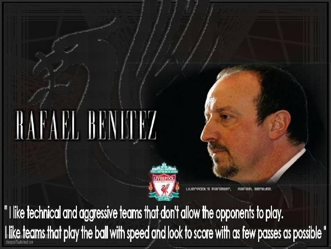
What becomes clear is that Gerard Houllier’s years seem to be the only managerial term where the team consistently outperformed expenditures. Houllier’s term also coincides with Liverpool’s Premier League era peak for youth players – see years six (’98-99) through eight (’00-’01) in the youth player chart earlier in this post. At that point Liverpool were running nearly double the league average with almost four homegrown players per match. Houllier leveraged players like Jamie Carragher, Steven Gerrard, Robbie Fowler, Michael Owen, David Thompson, Dominic Matteo and Steve McManaman to outperform the MSq£ regression model (although some would point out Houllier inherited all of the homegrown talent). The later years of Houlier’s term represented a movement in the wrong direction both in terms of youth players and MSq£ – while still over performing versus expenditures, the club’s backwards slide in the table was not satisfying ownership or supporters’ expectations. Enter Rafael Benítez.
Rafa Benítez’s record is mixed. Overall, it’s a push with three seasons of over-performance, two as pushes, and one under-performance. The under-performance came in the first season, but the two pushes came in Rafa’s final three seasons with the club. Benítez didn’t inherit as many quality homegrown players and continued the steady downward trend in this metric, relying mainly on Carragher and Gerrard. This meant more of his team would be built on transfers, making success more challenging given Liverpool’s modest resources versus the competition (especially after a leveraged buyout).
His best over-performance was clearly the 2008-2009 campaign where Liverpool finished with 86 points. That year’s MSq£ was fourth highest, while the regression equation would have predicted a finish position of 6.62. Sadly, poor performance and low team morale resulted in the predicted seventh place finish in 2010. Rafa, who averaged 7 points a season more than Houllier (and who did far better in Europe) left soon afterward. [The analysis in Pay As You Playclearly shows how much better Benítez's spending was in comparison with Houllier, particularly in terms of how their respective signings increased in value.]
Overall, Liverpool’s years in the Premier League have been a push. They have underperformed versus the MSq£ rank, but outperformed the regression equation. Until the ’06-’07 season they were also had the second highest utilization of youth players within the Big Four, nearly double Chelsea and Arsenal. These points are key, as history establishes realistic expectations going forward. While Liverpool has ranked high in MSq£ rank, they have consistently been number four within the Big Four.
They also seem to have occupied an interesting position in the Big Four. Chelsea has spent absurd amounts of money to compensate for the manager carousel they’ve experienced. Manchester United has been able to combine both high expenditures and management stability to set the standard for championships in the Premier League. Arsenal has relied on the genius of Arsene Wenger to keep them competitive with a modest MSq£. Liverpool seems to have had the worst of both worlds – a high turnover in managers and a very modest MSq£ compared to the big spenders they were chasing.
Liverpool’s MSq£ has steadily fallen by about 0.1 each season since 2003-2004, and is now the second lowest of the top six in the league (Arsenal is the only team with a lower MSq£). Liverpool has regressed to an MSq£ of 1.3 for the 2010-2011 season, leading to a predicted finish of 8.64. In the near term, Liverpool looks to be an upper mid-table club if they can get the right management and spend modest money. Longer term, they face a rebuilding task that needs a vision, a budget, and a manager to execute it.
The 2010-2011 Season So Far
So what does this all mean for this season?
The chart below summarizes each team’s performance to date versus their rank of MSq£ and the regression equation’s predicted finish. Chelsea’s, Manchester United’s, and Manchester City’s predicted finish from the regression equation had to be clipped to 1.0 as their MSq£ for 2010-2011 was so high that it lead to projected finishes of less than zero. Negative values versus the regression indicate over-performance, while positive values indicate under-performance.

Clearly, the two biggest over performers are Bolton and West Bromwich Albion – both of which are placing nearly nine spots higher than the regression would predict and 10 spots higher than their place in the MSq£ rankings. Arsenal, Blackburn, and Blackpool also deserve special mention – each is at least five places higher than both the regression analysis and MSq£ rankings would indicate.
Chelsea and Manchester City are penalized due to their large spend (ranking 1-2 in MSq£), while dropping points and expected table position. Nothing short of a top finish for either will match the expectations set by their expenditures. Spurs and Manchester United are right where they should be. All of this makes for a congested top six in the table, where at least two of the current Champions League participants have a real chance of not being able to find a seat when the music stops playing at the end of the season.
At the bottom end of the table, perennial Premier League members Aston Villa are disappointing their management given the cash they’ve outlayed for them. They are 10 spots below their MSq£ rank and more than four positions below their regression equation prediction. The biggest underperformer of all is West Ham United, whose mid-table MSq£ outlay has resulted in a disappointing run at the bottom and six places lower than the regression equation predicts. Fulham and Wigan are punching five spots below their MSq£ rank, but only two to three spots below what the regression equation predicts.
It’s a long season, and a lot can change between now and May 2011. As Graeme Riley has pointed out, this season has been far less predictable than those past. Perhaps we’re witnessing the beginning of a new age when money matters less, or maybe it’s just one where the disparity in squad cost, and resultant performance, is far less. Either way, it may leave some big spenders disappointed, some frugal clubs pleasantly surprised, and others just happy to not be relegated.
Conclusions
The quote at the outset of this post noted that the Soccernomics wage model accounted for 89% of the variation between wages and finish position, while the MSq£ model accounts for nearly 70% of the variation between MSq£ and finish position. A stronger relationship to wages makes sense. Players’ contracts can be renegotiated or extended to account for improvement or degradation in play since they initially arrived, while the CTPP data used to generate the MSq£ data is a static value that only changes based on overall transfer market conditions and not an individual player’s performance after the transfer. Nonetheless, a transfer must take place before anyone can negotiate wages or play a game for the new team and begin to generate data for “relative contribution” metrics. Paying for transfers is a pre-requisite for getting the talent a team hopes contributes to superior finishes on match day. Combine this with the uncertainty in obtaining reliable wage data versus more public transactions in the transfer market, and a compelling case can be made to look at transfers first and conclude they are the price-of-entry to having a shot at Premier League success. Once a player has been purchased, wages or utilization metrics are better suited to diagnosing actual performance versus expectations.
Understanding who’s spending money on transfers and how much more they are spending than the other teams in the league is critical to understanding their ability to compete for top finishing positions. At any moment in the 2010-2011 season, the average Premier League team is fielding a squad of ten transfers and one home grown player. The quality of those transfers as indicated by their current transfer purchase price and the team’s likely finish position seem to be highly correlated.
To understand a team’s relative expenditures is to begin to understand their potential table position. Doing so helps set realistic expectations for the squad, the team’s management, and its supporters. Ignoring this reality can lead to unrealistic expectations which in the end create a desire for quick solutions that can cause more organization and financial turmoil, setting the team further back from its goals for table finish.
*[Since the original publication of this blog entry I have been contacted by Soccernomics author Stefan Szymanski and this is what he had to say about the wage data used within Soccernomics:
“You question the quality of the wage data but I’m not sure that’s right- this is audited data from the company accounts published annually - not a guess like you see in Forbes. Its one weakness is that it is total payroll data, not just players- but players account for 90% plus of payroll normally. It must be much better quality than transfer fee data which is not audited and represents figures mentioned in the newspapers- the clubs never reveal the actual transaction value, and I’m told there are a lot of inaccuracies. Without getting confirmation directly from the clubs, there is no way to check this.”
Indeed, it appears the wage data used in Soccernomics is of the highest quality. I retract my earlier comment questioning its quality. At the same time, I would stand by the CTPP database being the most accurate of its kind for transfers. Stefan was quite complimentary of the overall post and its predecessor deconstructing his work at my blog, for which I am very grateful. Ultimately, he and I would agree on the wage data being a better predictor given its higher R2value for the same reasons I gave at the conclusion of my post. I hope that Paul and I can engage Stefan in future analysis of the CTPP database and continue to shed light on the impact of finances on the result on the pitch.]
Zach Slaton is a mechanical engineer and Six Sigma Black Belt by day. At all other times, he is an Arsenal-loving, Seattle Sounders FC-supporting fan of soccer and the emerging field of soccer statistics (and Tomkins Times subscriber). You can find him on Twitter, as well his own blog which delves into deep statistical analysis of the English Premier League and Major League Soccer. He lives in Seattle with his wife and two children.


No comments:
Post a Comment